I have created my evaluation using the website. http://www.prezi.com/. I did my evaluation on Prezi so that it was more interactive and creative rather than just creating a presentation on Microsoft Powerpoint and reading it out like I did for my AS Media Studies Evaluation. I found Prezi to be very interesting and much more effective than Microsoft Powerpoint as I could create a path showing my evaluation that i created in a certain order using the path. I could also make things look much more visually interesting and effective by using Prezi.
Link to my Prezi:
Monday, 24 January 2011


Tuesday, 18 January 2011
Radio Advertisement
Here is the radio advertisement I have created for my newspaper. I decided to stick with my original idea of using the ransom note from my poster advertisement as part of the script for my radio advertisement. I went for this idea so that it would be easily recognisable to the viewers and listeners as I would have aspects from each product I have created within each other as well as having the logo included in all three. I wanted to include the brand name in each product, as because it is a new product, it needs to be recognised by the audience so I thought if the brand name is included in all three products the audience may recognise the name and may encourage them to go and pick up my newspaper if they see and hear the brand name everywhere they go.
I got one of the students in my Media Studies class to read out the script whilst I was recording it.
The background music I used in the radio advertisement I got off a website called live.freeplaymusic.com and the track that I used was called "Take That". I thought that this was a relevant sound track to use as it it had quite a modern beat that would be suitable for the target audience. I also thought it was suitable as it wasn't too quiet to be boring and not catch the attention of the listeners but it also wasn't too loud and over powering that it would take away the attention from the speaking part of the advertisement leaving the viewers unaware of what the radio ad is advertising.
I am happy with the overall radio advertisement as it does everything that I wanted it too.
- It relates to the other two products I created.
- It is simple but effective.
- The background music I used is suitable for the target audience.
- The background music is also suitable for the script I created.
- The script is interesting and spoken with enthusiasm.
- Appeals to younger people - target audience of my newspaper.
Monday, 17 January 2011
Radio Advertisement Script
Music starts intro -
Music fades into background -
'Listeners,
If you want
Sport, fashion, local news, music and celeb gossip,
You know what you have to do.
Liverpool today,
Liverpool's newest student newspaper.
Pick it up for free at your local college!
Liverpool today,
Pick it up now!
Music fades back in -
Music fades out.
Tuesday, 4 January 2011
Planning Radio Advertisements
I've decided I want to stick with the same information and the same style for each product I construct. For the poster campaign I included the newspaper logo to make it obvious for the readers what the poster is advertising, so for the radio advertisement I will include the newspaper name so that the three products are all linked together. I also used the same colours and same information on my poster campaign that I used on my newspaper, so for the radio advert I will use the same text i used on my poster campaign so that the three products relate with each other.
Ideas
As I want my three products to link together and relate to each other, I came up with the idea of using the text on the poster campaign for my radio advert. As this is only a small amount of text I will have to expand the information and add more text to make my radio advert long enough and a reasonable time of under 30 seconds.
The text i have planned to use is:
'Listeners,
If you want sport, fashion, local news, music and celeb gossip,
you know what you have to do.
Liverpool today,
Liverpool's newest student newspaper.
Pick it up for free at your local college!
Liverpool today,
Pick it up now!
Radio Advertisement Research
I wanted to do further research into radio advertisements by analysing different styled radio ads. This radio advert for Yell is very different to the Alton Towers radio advertisement as they have created this in a way that the audience and the listeners will remember the advert and get it stuck in their head. '118 24 7' is the number that they are advertising, because of this they need to get the audience to remember the number in order for them to ring it so they have used the technique of turning the advertisement into a song. I find this to be a very successful method as it will most definitely catch the attention of the listeners and get it stuck in their head. It is a simple and catchy tune so whenever they hear it the listeners will automatically know what advert it is being played. Although i find this method to be most successful when creating a radio advertisement, I don't think it will be suitable for a newspaper radio advertisement as the only thing the audience needs to remember in my radio advertisement is the name of the newspaper. I think the most suitable option for creating my own radio advertisement is to write a catchy script with a repetitive tag line to make the audience get familiar with the name of the newspaper.
Radio Advertisement Research
After I had completed my poster campaign I had to research into radio advertisements in order to create a successful radio advertisement of my own. Here is one of the radio advertisements I found on YouTube advertising Alton Towers Scarefest.
They have used a male voice over for the start of the advertisement talking about a ride in Alton Towers, that then fades out and a creepy tune starts in the background as another male voice over speaks in a spooky accent. I find this to be effective and suitable for an Alton Towers advertisement as it should be spooky and scare the audience due to the thrill that you get in Alton Towers on the rides. This method is effective as it relates to Alton Towers, I think this style of advertisement would be suitable for when i make my newspaper radio advertisement as it is persuasive and interesting and will attract the audiences attention.
Newspaper Poster Advertisement
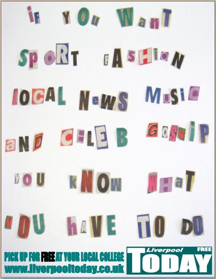
I decided to go with the ransom note idea I had as I thought it would look more effective and catch the attention of the audience as it more appealing to read than simple normal writing.
I think the idea is very interesting and different but relates to newspapers as I used cut out letters from different newspapers to create the ransom note effect.
I decided to use coloured letters instead of sticking with black and white letters as I think it looks more modern and eye catching and would attract the target audience of my newspaper.
I included the logo and website address on my advertising poster to make it easier for the audience to recognise what the poster is advertising and i also included where the newspaper is distributed to inform the audience where they can pick it up if the poster interests them.
My poster is very simple as there are no images involved, I decided to just use text because i believe if the information and text is persuasive and gets straight to the point then there is no need to add anything else to it as it should inform the audience enough.

I think the idea is very interesting and different but relates to newspapers as I used cut out letters from different newspapers to create the ransom note effect.
I decided to use coloured letters instead of sticking with black and white letters as I think it looks more modern and eye catching and would attract the target audience of my newspaper.
I included the logo and website address on my advertising poster to make it easier for the audience to recognise what the poster is advertising and i also included where the newspaper is distributed to inform the audience where they can pick it up if the poster interests them.
My poster is very simple as there are no images involved, I decided to just use text because i believe if the information and text is persuasive and gets straight to the point then there is no need to add anything else to it as it should inform the audience enough.
Tuesday, 30 November 2010
Planning my Newspaper Advertising Posters
Ideas for my advertising posters
Idea 1
Idea 1
- College related
- Student related
- Suitable for a free newspaper - state that it is free - attract more readers
- Maybe similar to the metro's advertising posters
- Use eye catching colours to make it stand out
- Keep it simple but effective, not to over crowded and hard to read
- Think of a successful quote to attract the audience and advertise newspaper
- Include logo so its easily recognised as it is a new newspaper
Idea 2
- Ransom note style - catchy phrase/quote to attract more readers
- simple/modern/effective
- Include logo so its easily recognised as my newspapers advertisement
- Stick to same colours for advert as the colours of my newspaper so it is consistent and easier to recognise.
- Photograph of newspaper?
- Some sort of photograph?
- Make it relate to students or college
- Suitable for a free newspaper - state that it is free - attract more readers
Idea 3
- Make a cartoon version of my newspaper,
- Relates to young people and students
- Stick to the same colours as my newspaper
- Simple and not to overcrowded
- Similar to The Metro's advertisements as they are simple but effective
- Catchy and clever phrase/quote to attract more readers.
- Suitable for a free newspaper - state that it is free - attract more readers
- Include newspaper logo to make it obvious for the readers what the poster is advertising
Idea 4
- Simple layout
- Similar to The Suns advertisement
- Big bold catchy, persuasive words to attract readers.
- Photographs in the background of students, college related material
- Suitable for students/college
- Modern to attract more young people
- State that it is a free newspaper to attract more readers
- Use same colours as the newspaper colours to make it easily recognised and make it consistent throughout.
- Include newspaper logo to make it obvious for the readers what the poster is advertising
The Metro Newspaper Advertisements


just pick it up, laid back, simple advertisements for simple reading
The Sun Newspaper Advertisements
The Sun use a completely different technique and effect to attract the readers than The Guardian do. Instead of keeping the background plain and simple and using colourful shapes to attract the audience, The Sun uses photographs of successful sports related men to attract the audience to read as the sun is mostly aimed at males and they base most of their stories around sports. Their advertising posters are, visually, very interesting and persuasive and they cleverly use images of celebrities and sportmen and persuasive language to attract their target audience to purchase their newspaper.
As well as The Guardian, The Sun also use powerful words as a technique to attract readers, except The Sun do it in a completely different way than The Guardian. Instead of using persuasive words and phrases that will attract the audience by letting them know that everyone has an opinion and everybody can have their say, The Sun advertises its own strong opinions: 'Big opinions every day'. They are informing the audience that their newspaper is opinionated on gossip as well as news.
One of their advertising posters is a receipt with the contents of their newspaper set out like a shopping list and stating that their newspaper is only 30p. After researching and looking at this advertisement it shows that its target audience is males and will not attract females as there are no contents inside this newspaper that will be relevent to or attract a female audience.
Overall, this newspaper also uses persuasive and effective techniques and although they're very different to the techniques used by The Guardian, they would attract their target audience well.


As well as The Guardian, The Sun also use powerful words as a technique to attract readers, except The Sun do it in a completely different way than The Guardian. Instead of using persuasive words and phrases that will attract the audience by letting them know that everyone has an opinion and everybody can have their say, The Sun advertises its own strong opinions: 'Big opinions every day'. They are informing the audience that their newspaper is opinionated on gossip as well as news.
One of their advertising posters is a receipt with the contents of their newspaper set out like a shopping list and stating that their newspaper is only 30p. After researching and looking at this advertisement it shows that its target audience is males and will not attract females as there are no contents inside this newspaper that will be relevent to or attract a female audience.
Overall, this newspaper also uses persuasive and effective techniques and although they're very different to the techniques used by The Guardian, they would attract their target audience well.


Monday, 29 November 2010
The Guardian Newspaper Advertisements
These images are the advertising posters for the Guardian. As you can see they stick to the same colours and style throughout. These colours are consistent throughout each product that the Guardian produces including their newspaper. This makes it much easier for the readers to identify that the products are for The Guardian. Although these posters are very simple, they are highly effective as the bright colours and designs that are used are eye catching and interesting, which will attract the audience to read and buy the newspaper.
The Guardian use strong words like 'listen', 'decide', 'facts' and 'opinions', to attract readers. They also use inspirational sentences letting the readers know that everybody has an opinion and you can agree and disagree with anything you want to.
The guardians advertisements are very powerful through the use of words. It shows that they are very confident in their writing and they don't need big dramatic advertising posters to attract readers, they just need confident and successful words to let them know that their newspaper is very intellectual and full of different views to make them want to buy and read their newspaper.
It is a very effective and successful way to attract readers by keeping the design and layout simple but making a powerful statement that the readers can agree with.


The Guardian use strong words like 'listen', 'decide', 'facts' and 'opinions', to attract readers. They also use inspirational sentences letting the readers know that everybody has an opinion and you can agree and disagree with anything you want to.
The guardians advertisements are very powerful through the use of words. It shows that they are very confident in their writing and they don't need big dramatic advertising posters to attract readers, they just need confident and successful words to let them know that their newspaper is very intellectual and full of different views to make them want to buy and read their newspaper.
It is a very effective and successful way to attract readers by keeping the design and layout simple but making a powerful statement that the readers can agree with.


Tuesday, 16 November 2010
Finished Draft Newspaper Second Page
This is the finished draft of the second page of my newspaper. As well as the front cover I will have to change the advertisement across the bottom of the page as I have used an existing brand. Although I created this advertisement myself, for copyright reasons I will not be able to use it so I will have to make up my own advertisement for the bottom of the second page.
As well as the advertisement, I think to make my newspaper more successful and effective I should experiment with the layout of the story i have included. To make it look readable and not too boring I think I should put the content of the story into columns, this should make my newspaper look more like a successful professional product.

As well as the advertisement, I think to make my newspaper more successful and effective I should experiment with the layout of the story i have included. To make it look readable and not too boring I think I should put the content of the story into columns, this should make my newspaper look more like a successful professional product.

Finished Draft Newspaper Front Cover
This is the finished draft of the front cover of my newspaper. For the completed product I will have to change the advertisement in the top right hand of the page as I have used an existing brand. I used a Topshop advertisement so I could see what my newspaper would look like when completed before I create my own advertisement. I think it looks successful although I think the advert needs a little bit of colour included into it as it looks to plain and simple.


Construction
Over the past 3 weeks I have been constructing the front page and the second page of my newspaper. As I had originally created designs for the layout of my newspaper, I used the layouts that were most successful with the target audience when holding a focus group. Next I had to decide the colours I was going to use, I tried out a few different colours to see what worked best and looked professional and eye catching. I decided to go with teal, black and white. I have used these colours consistently throughout the two pages of my newspaper as they are the colours that will relate my newspaper.
From analysing the newspaper The Metro, I stated that I really liked the way that the contents on the front page where identified by having their own colour for each of the topics. I decided to take this idea and use it on my newspaper by using pink for 'fame', blue for 'sports', green for 'local news' and purple for 'fashion'. These colours will also be used inside the magazine identifying the topics as they do on the front page. On my second page of my newspaper I have written a story relating to fashion so I have used purple for the background of the heading so that the audience can relate it to the topic fashion as it does on the front page.
I have used the same font styles throughout the newspaper so that it is consistent. I have used Impact for my headings and masthead of the newspaper, and used Calibri for the information and stories in my newspaper.
As it is a free newspaper, I have had to include a lot of advertisements. All of these advertisements that I have included in my newspaper I have created myself using photoshop and paint. I wanted them to look as realistic as possible so I tried to use a similar style and font for my advertisements as the actual advertisements are without plagiarising. Also each of the photographs and images I have used I have taken myself for the project.
For the masthead of my newspaper, I thought of a couple different names that would be relevant but the one that I chose to use was 'Liverpool Today' as it is a daily newspaper and it is distributed throughout Liverpool, i thought it had the most relevance to the actual newspaper.
From analysing the newspaper The Metro, I stated that I really liked the way that the contents on the front page where identified by having their own colour for each of the topics. I decided to take this idea and use it on my newspaper by using pink for 'fame', blue for 'sports', green for 'local news' and purple for 'fashion'. These colours will also be used inside the magazine identifying the topics as they do on the front page. On my second page of my newspaper I have written a story relating to fashion so I have used purple for the background of the heading so that the audience can relate it to the topic fashion as it does on the front page.
I have used the same font styles throughout the newspaper so that it is consistent. I have used Impact for my headings and masthead of the newspaper, and used Calibri for the information and stories in my newspaper.
As it is a free newspaper, I have had to include a lot of advertisements. All of these advertisements that I have included in my newspaper I have created myself using photoshop and paint. I wanted them to look as realistic as possible so I tried to use a similar style and font for my advertisements as the actual advertisements are without plagiarising. Also each of the photographs and images I have used I have taken myself for the project.
For the masthead of my newspaper, I thought of a couple different names that would be relevant but the one that I chose to use was 'Liverpool Today' as it is a daily newspaper and it is distributed throughout Liverpool, i thought it had the most relevance to the actual newspaper.
Monday, 18 October 2010
Planning Construction
After holding a focus group I have gathered alot of information to help me when constructing my newspaper.
I have now decided what layout i will be using for my front cover and first page of my newspaper.
I will start planning the contents that i will be including in both pages of my newspaper and finding stories to write about that will be appealing to the target audience.
I have now decided what layout i will be using for my front cover and first page of my newspaper.
I will start planning the contents that i will be including in both pages of my newspaper and finding stories to write about that will be appealing to the target audience.
Research and Planning
From my research and planning I have gathered a lot of useful information that will help me when constructing my newspaper. From all of this I have found what styles and techniques are most popular when constructing newspapers and I have also found what topics, stories and layouts etc the target audience found most interesting and relevant to them from constructing and giving out questionnaires to students and from also holding a focus group.
The questionnaires and focus group have been very useful and helpful to me as I now know what my target audience would specifically like to see in newspapers to persuade them to read it and also what they wouldn't like to see in newspapers. I have found that the topics I need to include in my newspapers are sport, fashion, celebrity gossip, local news, music and items that are relevant to students. Hopefully by including these topics in my newspaper, it will persuade students to read it as they are the topics that they said they would like to see in local newspapers. I should also avoid including politics, world news, and irrelevant information in my newspaper as this will be unsuccessful to my target audience.
I have also found from my questionnaires that the majority of the students would prefer the newspaper to be free, so in order for my newspaper to make money I need to include relevant advertisements in Liverpool to attract the students.
When I have successfully constructed my newspaper it will be distributed in Colleges and Universities as they are the most popular locations for distribution voted by students from my questionnaires.
Focus Group
I have held a focus group to receive feedback on my target audiences' thoughts and opinions of what I have planned for my newspaper so far. I created a series of front page layouts and first page layouts for the audience to give me some feedback on what they think has worked best and what they like and think is interesting about them. I have also mentioned the top ten fonts that are used in newspapers to receive feedback on what they think would work best with the style and age range of my newspaper. Lastly, I will ask them what colours they think will look interesting and what they would like for the general colours in my newspaper. I have decided that I want to challenge the codes and conventions of colour in newspaper and instead of using red and blue I will change it slightly and use other successful bold colours that work well with each other and look interesting.
Here is some of the feedback I have received from discussing layouts, fonts and colours:
Layouts
Front Cover:
The majority of the people in the focus group commented that layout 3 for my front cover is original and interesting but it may be too risky as the masthead is down the left hand side of the page but they would like to see what the finished result would look like to see if it worked well or not.
They also stated that layout 1 and 4 are successful and would work well as the main story gets priority and takes up most of the page. They said that this would be really successful and get a lot of readers if the main story is interesting and relevant.
Lastly they commented on layout 4 and said that they are intrigued to see what the newspaper would look like with a full masthead taking up the whole top section of the front cover.
First Page:
All of the students in my focus group decided that layout 2 is the most successful page layout as it is set out in an organised fashion. The contents, contact information, lottery numbers and the weather taking up the top third of the page. The story and image linking to the story is in the centre of the page and across the bottom of the page is the advertisement. The people in the focus group said that this looks really successful as it is very organised and easy to navigate and spot where each section is on the page. They commented that it looks much more successful than other newspapers where their layout isn't set out in a specific way and everything is cluttered and is hard to navigate and find what you want to look at.
Fonts
I discussed the fonts I have researched and and the top 10 fonts used in newspapers. The feedback I received from the focus group was to not use any of these fonts as my masthead as they are much too simple and wouldn't make my newspaper stand out from the rest of the local newspapers. They stated that I should look at different websites to get more of an insight into more interesting, bold and original fonts for my masthead.
They all preferred the more modern, rounded fonts for my contents and headlines than the traditional fonts as the modern fonts relate more to the younger generation and will work well with the style and target audience of my newspaper.
Colours
After discussing with the students in the focus group that I want to challenge the codes and conventions of colour and I want my newspaper to be unique, they decided that that would be a really successful thing to do if the right colours are chosen as it would make the newspaper stand out from the rest of the local newspapers. I showed them the colour wheel as it shows a lot of different colours and shades of colours that could work well for my newspaper.
They discussed that they think that the bottom half of the colours on the colour wheel would be successful colours to use as they are not too masculine or feminine and are not biased towards a specific gender. They decided that purple, blue, green, red, and orange could be good colours to use but they would like to see the final fonts, stories and layouts to see what colours would work best with them.
Here is some of the feedback I have received from discussing layouts, fonts and colours:
Layouts
Front Cover:
The majority of the people in the focus group commented that layout 3 for my front cover is original and interesting but it may be too risky as the masthead is down the left hand side of the page but they would like to see what the finished result would look like to see if it worked well or not.
They also stated that layout 1 and 4 are successful and would work well as the main story gets priority and takes up most of the page. They said that this would be really successful and get a lot of readers if the main story is interesting and relevant.
Lastly they commented on layout 4 and said that they are intrigued to see what the newspaper would look like with a full masthead taking up the whole top section of the front cover.
First Page:
All of the students in my focus group decided that layout 2 is the most successful page layout as it is set out in an organised fashion. The contents, contact information, lottery numbers and the weather taking up the top third of the page. The story and image linking to the story is in the centre of the page and across the bottom of the page is the advertisement. The people in the focus group said that this looks really successful as it is very organised and easy to navigate and spot where each section is on the page. They commented that it looks much more successful than other newspapers where their layout isn't set out in a specific way and everything is cluttered and is hard to navigate and find what you want to look at.
Fonts
I discussed the fonts I have researched and and the top 10 fonts used in newspapers. The feedback I received from the focus group was to not use any of these fonts as my masthead as they are much too simple and wouldn't make my newspaper stand out from the rest of the local newspapers. They stated that I should look at different websites to get more of an insight into more interesting, bold and original fonts for my masthead.
They all preferred the more modern, rounded fonts for my contents and headlines than the traditional fonts as the modern fonts relate more to the younger generation and will work well with the style and target audience of my newspaper.
Colours
After discussing with the students in the focus group that I want to challenge the codes and conventions of colour and I want my newspaper to be unique, they decided that that would be a really successful thing to do if the right colours are chosen as it would make the newspaper stand out from the rest of the local newspapers. I showed them the colour wheel as it shows a lot of different colours and shades of colours that could work well for my newspaper.
They discussed that they think that the bottom half of the colours on the colour wheel would be successful colours to use as they are not too masculine or feminine and are not biased towards a specific gender. They decided that purple, blue, green, red, and orange could be good colours to use but they would like to see the final fonts, stories and layouts to see what colours would work best with them.
Subscribe to:
Posts (Atom)